PROJECT BACKGROUND
The purpose of the project is to redesign a simple webpage. This process conists of identifying the flaws (userability, learnability, memorability) of the currently existing webpage, creating low-fidelity and high-fidelty prototypes for various screen websites, and then building a working & reponsive website.
I chose New Peking's Chinese Restaurant as the interface for redesigning. The un-usability of the website hinders the business from attracting customers and generating additional revenue through online ordering. Because of the pandemic, online ordering has now become vital to a restaurant’s sources of revenue so that’s why there are flaws within the website that I want to improve for the restaurant to reach customers more effectively.
CHOSEN WEBSITE
Click on any of the screen sizes to open current website in new tab!

Small Screen
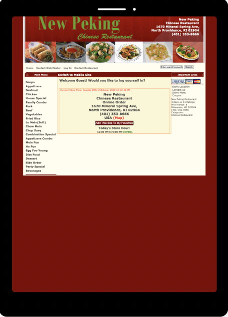
Medium Screen
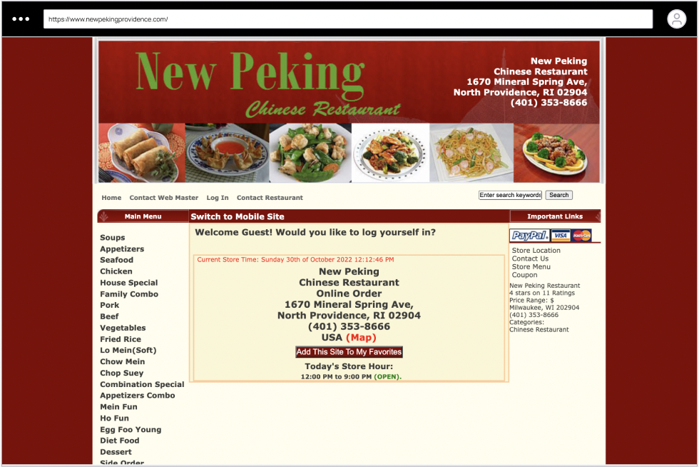
Large Screen
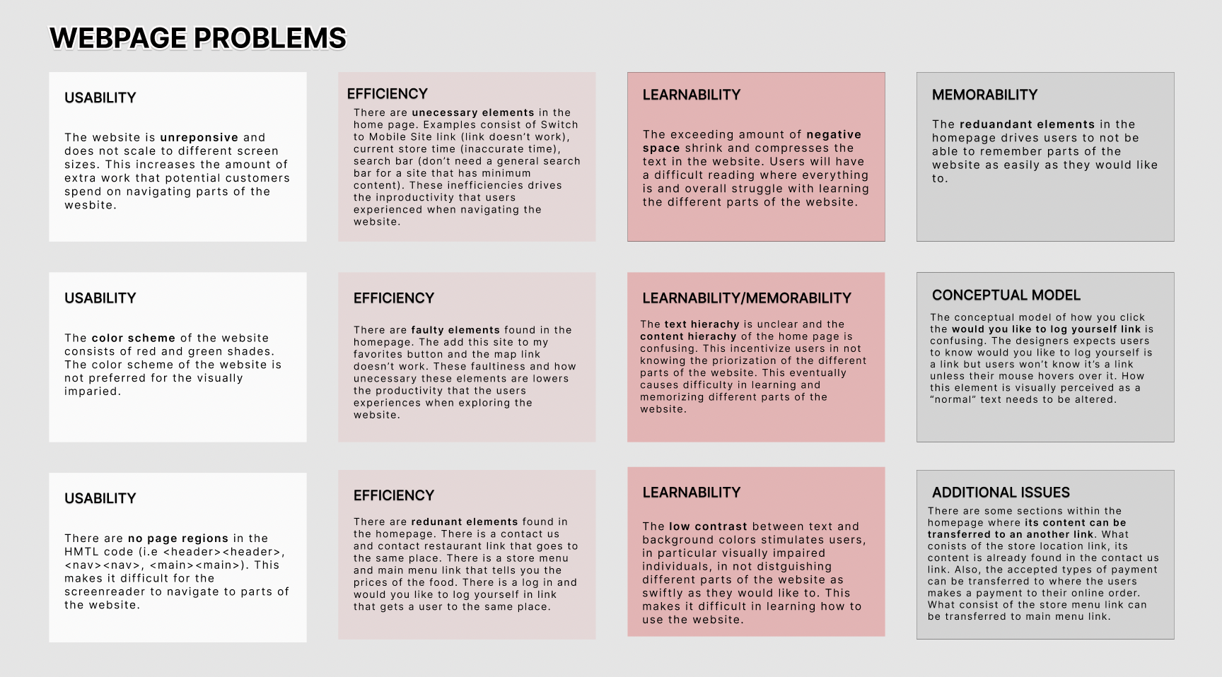
USERABILITY PROBLEMS
Below, I first identified particular problems with the original page and categorize it into different sections.
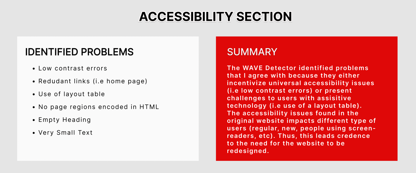
I further identified problems with the orginal page by using a web accesssibility evaluation tool.
LOW-FIDELITY PROTOTYPES
After identifying the problems from the original website, I created low-fidelity wireframes for each of the screen sizes that is generally supported (desktop, tablet, mobile respectively). On each of the prototypes, I annotated how I will redesign the original webpage in different screen resolutions, with keeping in mind the existing problems found in New Providence Chinese Restaurant webpage. These wireframes were created through the Balsamiq WireFrames application.
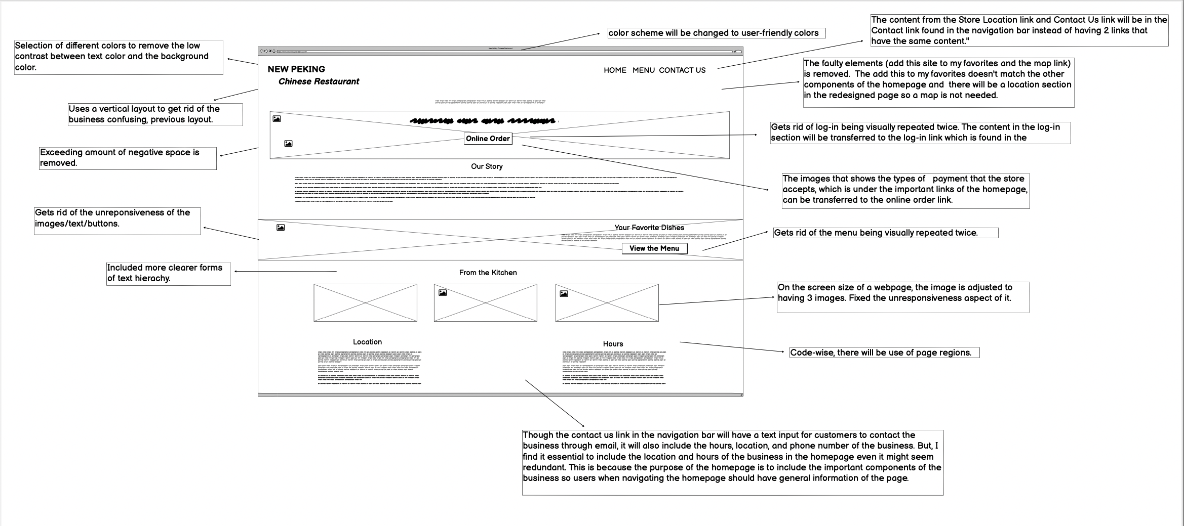
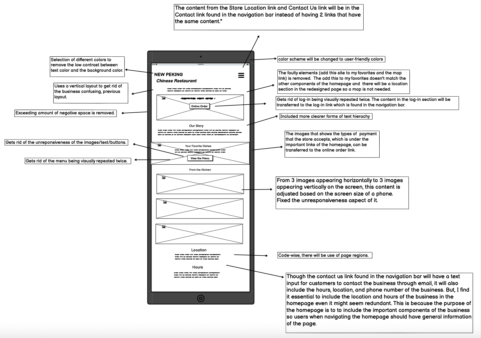
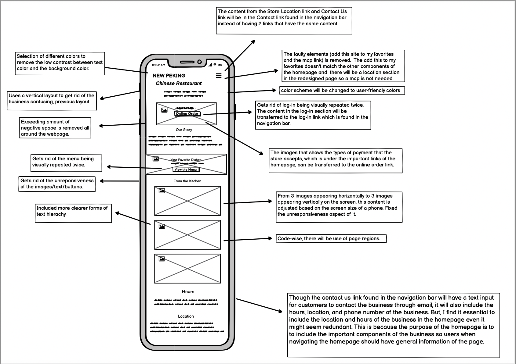
NOTE: The design choices integrated into the redesigned webpage is made with justifiable intention. Originally, the website did not have a our story section and the colors are different from what I chose for the redesigned webpage. I decide to implement these changes (about us section and different color palettes) because the our story section introduces the company itself to website visitors (the company is basically marketing itself to potential consumers in 1-3 sentences). In addition, the low contrast of the colors will make it difficult for people with low vision and colorblind people to distinguish the colors. As the New Peking's Chinese Restaurant should be accessible to everyone, that's why there is such a shift from the original color palette to the revised color palette of the website.
VISUAL DESIGN STYLE GUIDE
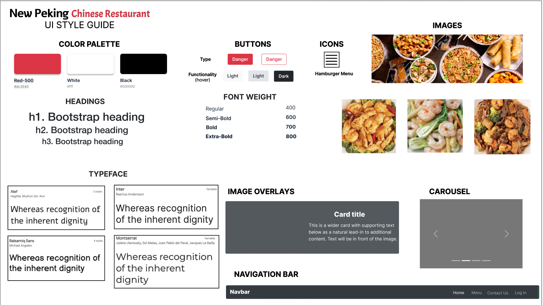
Before redesigning the orignal website, I built a style guide that displays the colors, typography, and interactive components of the webpage. The guide helps to ensure that the styles and interactive elements is consistent throughout the site in order for the user to have a coherent experience navigating the interface. However, there are some interactive elements that wasn't used for the redesigned website (i.e carousel).
HIGH-FIDELITY PROTOTYPES
After deciding on the interactive components and styles, I expanded on the low-fidelty wireframes by using Figma to create high-fidelity prototypes for the three different types of screen resolutions (mobile, tablet, computer). These prototypes contain HTML/CSS annotations of key layout choices for others to be able to easily reproduce the redeisgned website. From top to bottom, the order of the high-fidelty prototype annotations goes from computer, tablet, to phone interface.
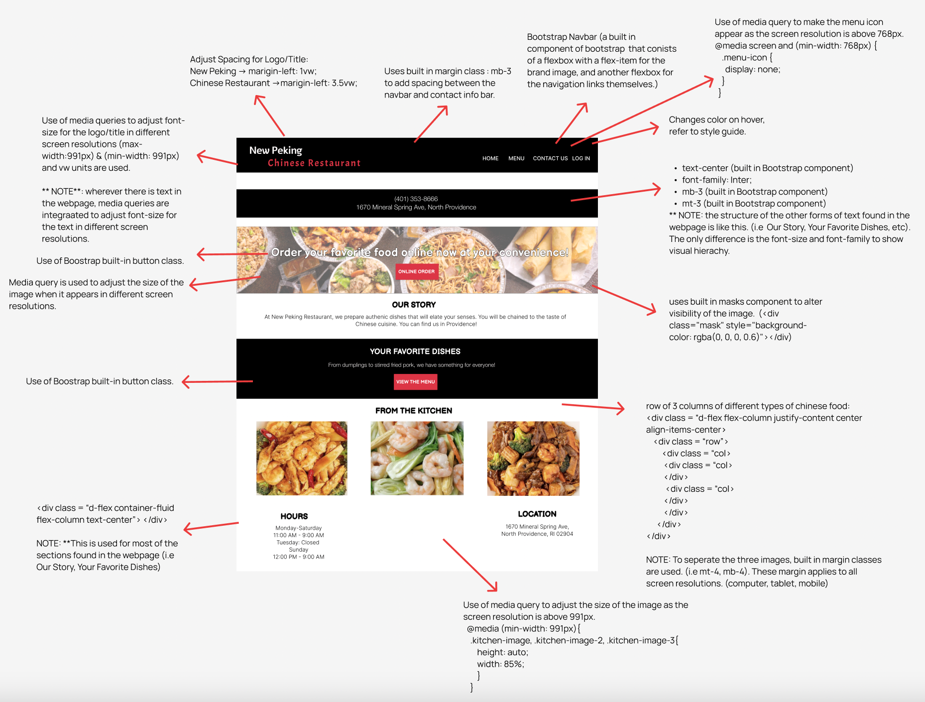
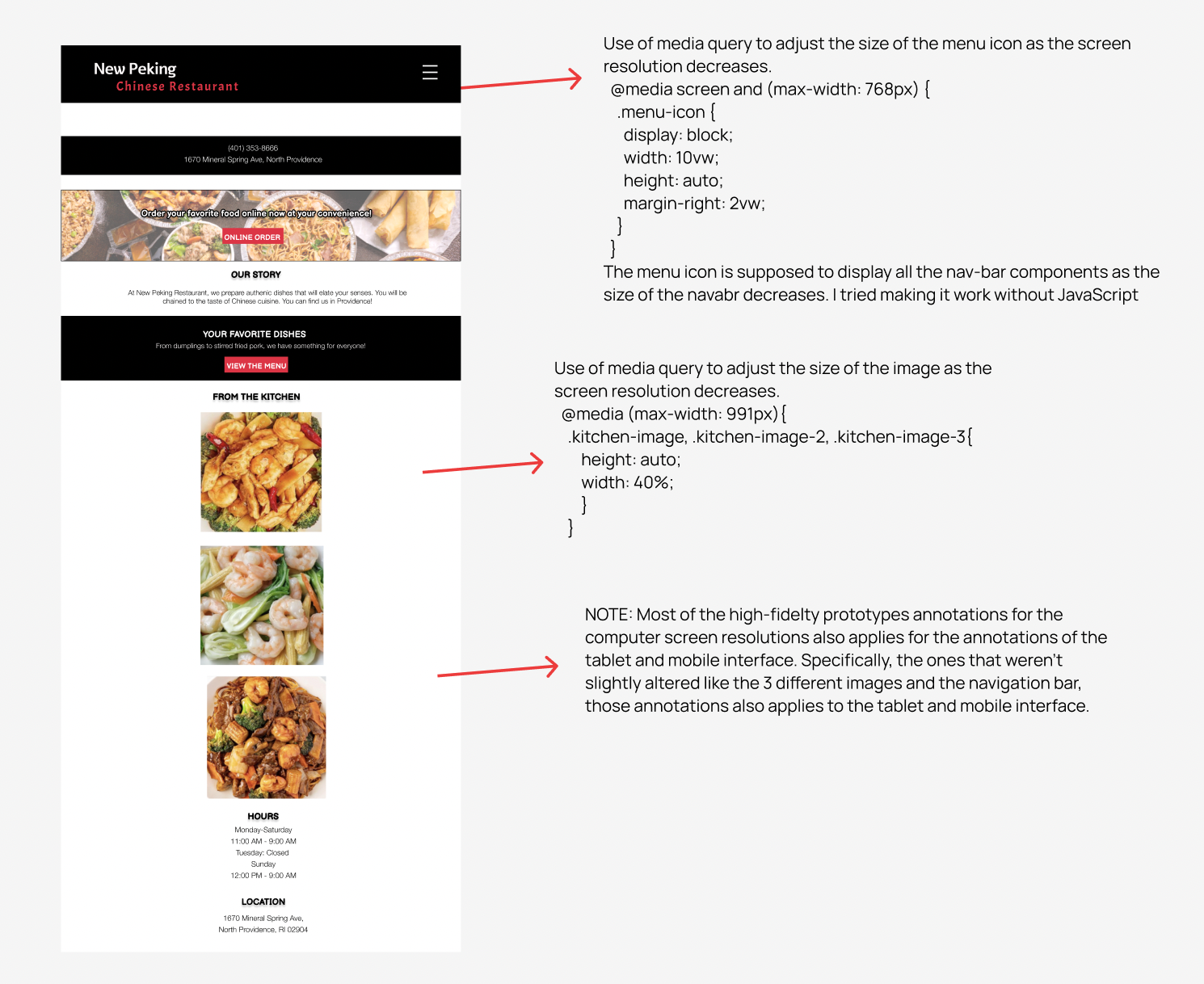
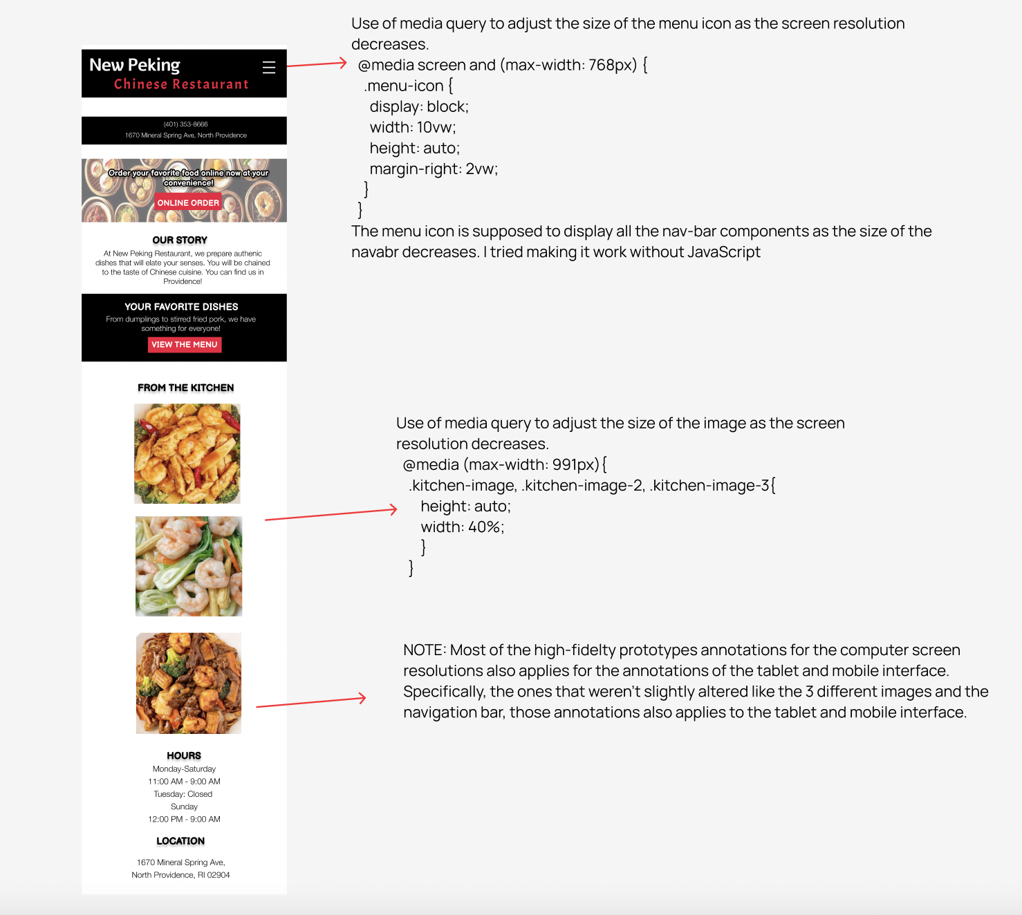
As you can probably infer, I will be designing the New Peking's Chinese Restaurant by using Bootstrap framework. This is because Bootstrap has built in components that enables reponsive-friendly websites and applications.
REDESIGNED WEBSITE
Click me to view the redesigned website!Using the final high-fidelity prototypes, I redesigned New Peking's Chinese Restaurant using HTML and CSS. Note: all buttons and and the hamburger menu on the redesigned page are dummy elements.